Can AI Draw You a Pretty Chart Without Lying About the Data?
Based on: ArtChart: A Benchmark for Faithful Artistic Chart Generation with Integrated Text Rendering — Meijia Huang, Yingjie Yin, Shihao Wang, Chenguang Ma
Picture a prompt like this: "Make a bar chart of world landmark heights, but draw each bar as the actual landmark." The model obliges. The Leaning Tower of Pisa, Tokyo Tower, Big Ben, the Statue of Liberty, and the Temple of Heaven line up in a row, each rendered as a little illustration instead of a plain rectangle. It looks great on a slide.
Now check the data: Pisa is 56, Tokyo Tower is 133, Big Ben is 96, the Statue of Liberty is 93, the Temple of Heaven is 58. Does the picture actually encode those numbers, or did the model just paint five vaguely landmark-shaped towers at whatever height looked balanced? For most current image generators, the honest answer is the second one. This is the exact failure mode a new paper called ArtChart, from a team at Ant Group, sets out to fix. It's not primarily an OCR paper, but the problem it tackles is the mirror image of what OCR engines deal with every day: whether pixels on a page can be trusted to mean what they claim to mean.
Why a "pretty chart" is actually two hard jobs stapled together
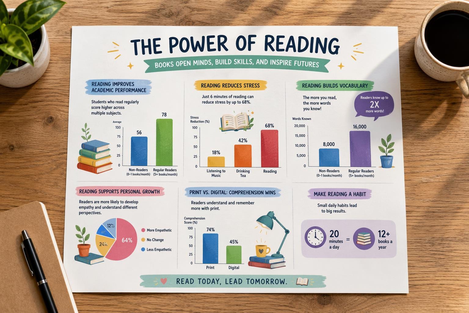
A chart that goes into a slide deck, an annual report, or a marketing page has to do two jobs at once. It has to be a legitimate chart: bar heights proportional to values, pie slices at the right angles, the right number of categories, labels attached to the right marks. And it has to look designed: a color palette, a theme, maybe a metaphor (turn the bars into skyscrapers, the pie into a plate of food). Ask a human designer to do this and they'll get both right, because they understand the numbers before they start drawing.
Ask a text-to-image model, and you get one or the other, rarely both. The ArtChart authors ran pilot experiments and sorted the failures into four buckets:
- Math logic distortion: wrong bar heights, wrong pie angles, the wrong number of bars or slices entirely.
- Text content errors: missing, duplicated, garbled, or flat-out wrong characters in labels and titles.
- Text layout mismatch: a value or category label sitting next to the wrong mark, or drifting off its bar.
- Visual style failure: stylization so aggressive the marks stop being readable, or so timid the chart doesn't look "artistic" at all.
Their framing is blunt: a chart is invalid if a bar has the wrong height, a pie sector has the wrong angle, a digit is hallucinated, or a correct value is placed above the wrong category, no matter how nice the rest of the image looks.
A blueprint the artist isn't allowed to redraw
ArtChart's fix starts by refusing to let the model improvise the numbers at all. Before any artistic generation happens, the system renders a boring, text-free grayscale chart using deterministic chart code, the same kind of pixel-accurate bar heights and pie angles you'd get from a plotting library. No title, no labels, no colors. Just geometry.
That grayscale skeleton then conditions the actual generation, through a chart-specific ControlNet (a well-established technique for steering diffusion models with a structural input image) trained on top of a frozen text-to-image backbone called Qwen-Image-2512. The idea is architectural: hand the artist a wireframe and tell them to add windows and a facade, but leave the floor plan alone.
The detail that makes this work is that a generic ControlNet, the kind trained on photos with edge maps or depth maps, doesn't know that in this particular gray image, the height of a rectangle is a number. It'll treat the chart like any other picture to be stylized. Training a ControlNet specifically on chart layouts is what lets the model understand that the geometry isn't decorative, it's data.
Teaching the model with three graders who don't agree with each other
Locking down geometry doesn't fix text. Once the skeleton was solid, the team found the dominant remaining errors were garbled or mismatched labels. So they froze the ControlNet and the base model, attached a small trainable adapter to the model's diffusion transformer, and trained it with reinforcement learning using a method built on GRPO (Group Relative Policy Optimization).
Two rewards drove that stage. One runs OCR on the generated image and matches the detected text against the intended labels using edit distance, scoring how close the rendered text is to correct. The other asks a vision-language model to check whether each label sits on the correct mark, in the correct position, not just whether the string is spelled right.
Then they added a third reward for aesthetics, based on PickScore, a model trained on human preference data, and ran into a predictable problem. Push hard on OCR accuracy and the model plays it safe: plain fonts, rigid placement, boring compositions. Push on aesthetics and text starts drifting and garbling again. Average all three rewards into one training signal and you get a compromise that's mediocre at everything, confirmed directly in their experiments: a naively blended model scored 9.49 on text, 7.51 on layout, and 7.61 on aesthetics, all below what a model trained on just one of those rewards could hit on its own.
Their answer is a distillation scheme they call OPD. Train three separate specialist models, one that only chases OCR accuracy, one that only chases layout correctness, one that only chases aesthetics, each pushed until it plateaus. Then train a single final model to imitate whichever specialist is best suited to a given training example, selected on the fly by a router. It's less "average three opinions" and more "learn from whichever expert actually knows this particular case."
The payoff shows up cleanly in their numbers. The OCR specialist alone hits 9.55 on text. The layout specialist hits 7.71 on layout. The aesthetic specialist hits 7.69 on aesthetics. The final distilled model lands at 9.54 text, 7.67 layout, and 7.61 aesthetics, within a hair of every specialist's own ceiling, on all three axes at once, instead of settling for the middle ground the naive blend produced.
Grading math without letting the grader read the answer key
To test all this, the team built ArtChart-Bench: 2,000 prompts split evenly between English and Chinese, covering four chart types (vertical bar, horizontal bar, pie, and area), and 15 style families ranging from minimalist to heavily ornate. The prompts are deliberately stress-tested: category counts from 2 to 10, value sequences that are mostly unordered but sometimes deliberately increasing, decreasing, or all equal, and value magnitudes that range from easy large gaps to deliberately near-identical or near-zero numbers designed to trip up a sloppy renderer.
Grading happens across six axes, each scored out of 10: mathematical logic, text accuracy, text layout, aesthetics, instruction following, and readability.
The cleverest piece is how they score mathematical logic. Asking a vision-language model "does this chart look correct?" is easy to game, because the model can just read the printed labels and assume the picture matches them. So they run OCR first, paint white boxes over every detected character, and only then hand the now textless image to the judge, asking it to estimate the geometric proportions from the marks alone. If a bar is labeled "42" but drawn at half the height it should be, this method still catches it, because the judge never sees the label. Text accuracy gets scored separately as an F1 measure over matched text units, layout as the fraction of labels correctly bound to the right mark and position, and readability as a check for both over-stylized illegibility and under-stylized blandness.
What the numbers actually showed
Run a plain text-to-image model with no chart-specific help and you get a mathematical logic score of 2.87 out of 10. Add a generic, off-the-shelf ControlNet and that jumps to 7.48, just from giving the model any structural scaffold to follow. Swap in the chart-specific ControlNet trained on grayscale chart layouts and it climbs to 9.06, the single biggest gain in the whole pipeline, and it comes purely from teaching the conditioning module that gray rectangles encode numbers.
Text and layout tell a similar story. Editing-based baselines, where you hand the model a rendered chart plus instructions, improve geometry somewhat but barely touch text quality. The full ArtChart pipeline finishes at 9.05 mathematical logic, 9.54 text accuracy, 7.67 layout, 7.61 aesthetics, 9.25 instruction following, and 7.54 readability, ahead of every baseline they tested on every axis.
The per-chart-type breakdown is where it gets more honest. Bar and horizontal-bar charts are the easy case: readability scores of 9.27 and 8.21. Area charts keep strong math and text scores but readability drops to 6.64, turning a filled region into an illustrated shape apparently makes it harder to read even when the underlying data is correct. Pie charts are the hardest category across the board, math logic at 8.65 and readability at just 6.05, because sector angles and labels arranged around a circle are simply less forgiving than bars on a grid.
Why it matters for anyone building or choosing OCR
This paper generates images rather than reading them, so it's not a competitor benchmark in the way most OpenOCR coverage is. But the underlying problem is the same problem run in reverse. An OCR engine has to verify that a string of pixels means what it claims to mean. ArtChart has to guarantee that before those pixels ever exist. Both jobs live or die on the same question: can you trust the text in this image.
Two things here are directly useful if you work with document or chart images. First, the four-part failure taxonomy (wrong geometry, wrong text, wrong label binding, unreadable styling) is a genuinely good checklist to run any OCR or document-AI pipeline against the moment it hits a stylized infographic pulled from an annual report or a marketing deck. Second, the "mask the text before judging the geometry" trick is worth stealing for evaluation work generally: whenever you're checking whether a system extracted the right values from a chart, don't let your checker peek at labels that might themselves be wrong.
There's also a longer-term angle. A pipeline that can generate charts with known, correct underlying data and verified label text is a pipeline that can generate labeled training and evaluation data for chart understanding and chart-OCR models, cheaply and at scale. That's a real byproduct even if artistic infographic generation itself stays a niche use case.
The honest fine print
The authors are upfront about where this doesn't reach yet. ArtChart still depends on that explicit grayscale skeleton, so the paper doesn't show that a plain text-to-image model can infer correct chart geometry straight from a text prompt alone. The benchmark covers one-dimensional categorical data across four chart types; grouped, stacked, multi-series, scatter, radar, and dashboard layouts, which is to say most of what actually shows up in real business reporting, are left for future work. And because the grading leans on OCR and vision-language models as judges, those judges can carry their own biases into the score.
Worth adding: the abstract promises comparison against "closed-source API models," but the results tables in the paper only pit ArtChart against open Qwen and FLUX family baselines. GPT-Image and a model called Nano show up earlier in the pipeline, generating training targets, not as rows in the final leaderboard. And the bilingual benchmark covers English and Chinese only, so it says nothing yet about how this holds up across other scripts. None of that undercuts what the paper actually demonstrates, that a chart-specific structural constraint plus a distillation scheme for reconciling competing rewards beats naive text-to-image and generic ControlNet approaches by a wide margin. It just means "artistic chart generation, solved" is a few benchmark expansions away.