The Map Benchmark That Catches AI Models Faking Vision
Based on: OmniMapBench: Benchmarking Visual-Centric Reasoning on Diverse Map Documents — Yang Chen, Yunwen Li, Yufan Shen, Minghao Liu, Tianyu Zheng, Bin Fu, Qunshu Lin, Zhi Yu, Botian Shi
Look at Figure 1 in this paper and you'll see something odd. On one side, there's a screenshot from DocVQA, one of the standard document-understanding benchmarks: a table full of survey data about smokers, with a question underneath asking what percentage feel the need to find more excitement in life. On the other side, there's what looks like a children's book illustration: a simple green neighborhood with a few houses, some winding roads, and cartoon trees. The question asks which house you'd see on your right if you enter from the left and keep driving.
The table is labeled "easy to describe." The cartoon neighborhood is labeled "difficult to describe." That's backward from how it looks to a human, and that's exactly the point. A model can convert the survey table into a paragraph of text and answer the question just fine, because tables are already halfway to being text. But try writing a paragraph that fully captures which house sits where relative to a curving road system, in enough detail to answer any possible question about it, and you'll find yourself either writing an essay or leaving something out. That gap between "looks simple" and "resists description" is what OmniMapBench, a new benchmark from Shanghai AI Laboratory, Zhejiang University, and collaborators, is built to expose.
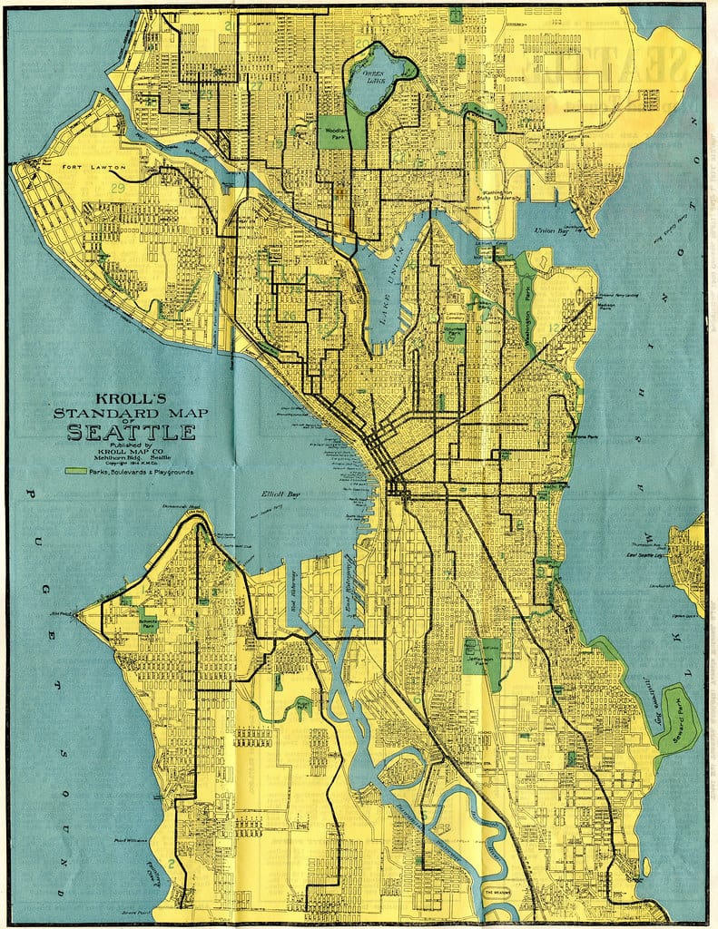
Seattle Map 1914 — by Rob Ketcherside via flickr, BY 2.0.
The trick most "visual" benchmarks don't realize they're playing
Here's the uncomfortable secret at the center of this paper. A lot of benchmarks that claim to test visual reasoning in large vision-language models (LVLMs, the models that can take both an image and text as input) can actually be solved without much visual reasoning at all. If a chart can be losslessly converted into a data table, or a document into OCR text, or a geometry diagram into a list of coordinates, then a model doesn't need to genuinely look at the image. It just needs to convert the image to text once and then do what LLMs are already good at: reasoning over text.
This isn't a hypothetical concern. The researchers point out that document images get converted into markdown all the time in retrieval pipelines, and that charts and tables are routinely turned into code or structured data. Even geometry problems, which seem visual on their face, are often "text-complete," meaning a verbal description of the shapes is enough to solve them. So when a benchmark reports that a model scored 90% on some "visual reasoning" task, there's a real question worth asking: did the model actually use its eyes, or did it just read?
Maps are the authors' answer to that question. A map's meaning lives in its spatial layout: contour lines, color-coded regions, symbols whose meaning depends on a legend, and the relative positions of things to each other. You can't flatten that into a clean paragraph the way you can flatten a spreadsheet. That's what makes maps a good stress test, and it's why OmniMapBench exists.
How you prove a benchmark actually requires eyesight
The clever part of this paper isn't just "we made a map benchmark." It's that the authors built a way to measure, for any benchmark, how much it actually depends on the image versus how much it can be gamed with text.
They call it the Visual Dependency Index (VDI), and the idea is simple once you see it. Take a benchmark. Run a strong model on it normally, with the real image, and record the accuracy. Then take away the image, but let the same model first generate a written description of that image (capped at a fixed token budget, so it can't just dump an infinitely detailed transcript). Feed that description back to the model instead of the picture, and measure accuracy again. VDI is just the percentage drop between those two numbers. If a model does almost as well working from its own text description as it did looking at the actual image, VDI is low, and the benchmark is telling you it doesn't need real vision. If accuracy collapses without the image, VDI is high.
The results are stark. At a description budget of 1,024 tokens, roughly enough for a few dense paragraphs, benchmarks like AI2D (science diagrams) and MMBench basically fall apart: their VDI drops to near zero, meaning a good enough paragraph gets you almost the same accuracy as the real image. OmniMapBench sits at the other end, with a VDI of 0.338, the highest of eleven benchmarks tested, including familiar names like DocVQA, ChartQA, and MathVista. The authors also track a companion metric called the Descriptive Saturation Index (DSI), which measures whether models keep using up their whole token budget trying to describe an image or give up early because there's nothing left to say. OmniMapBench scores 0.629 there, second-highest in the comparison, meaning models keep straining for more words to describe these maps even at the token ceiling. Put those two numbers together and you get a benchmark that resists the text-conversion shortcut from two different angles.
Building 1,603 maps that can't be talked around
The dataset itself is smaller than some famous VQA benchmarks (DocVQA has around 50,000 question-answer pairs; OmniMapBench has 2,096), but the construction process is worth walking through because it explains why the questions are hard to shortcut.
The team started by scraping and manually collecting over 5,000 map images, using an LLM to generate varied search queries across nine target categories, plus targeted sourcing from government portals and social platforms for specialized map types like transit diagrams. They filtered that pool down to about 2,000 images, removing near-duplicates, low-resolution scans, and anything touching politically sensitive regions. Human annotators then wrote question-answer pairs by hand, following strict rules: every question had to be answerable using only the visual information in the map, with no outside knowledge required, and formatted as single-choice, multiple-choice, or ordering questions to keep grading objective.
Annotators also had to hit three difficulty tiers on purpose: Level 1 questions test basic perception (can you find and read a symbol), Level 2 tests single-step spatial reasoning (which of these two points is closer to the river), and Level 3 tests multi-step relational reasoning (trace a route through several turns and report what's visible along the way). That first pass produced 3,386 QA pairs, which were filtered and rebalanced down to 2,882, then run through a second, independent round of cross-validation where a different team of annotators checked every pair for correctness and category accuracy. Whatever didn't survive that check got thrown out. What was left: 2,096 pairs across 1,603 images.
The nine categories give a sense of how broad "map" gets stretched here: Indoor Navigation (18.3% of images), Education & History (17.2%), Engineering & Facilities (16.8%), Transportation (15.7%), Tourism (13.2%), Topography & Remote Sensing (7.3%), Environment & Nature (5.2%), Socioeconomic (3.9%), and, notably, Game maps (2.4%), meaning fictional fantasy or video-game world maps. That last category is a deliberate jab at benchmarks that assume maps mean real-world geography. Prior map-specific benchmarks tend to specialize narrowly, like ReasonMap (transit maps only, around 30 images) or MapQA (choropleth maps only). OmniMapBench's bet is that variety, from subway diagrams to mall directories to floor plans of evacuation routes, is what actually stresses a model's general spatial reasoning rather than its familiarity with one map style.
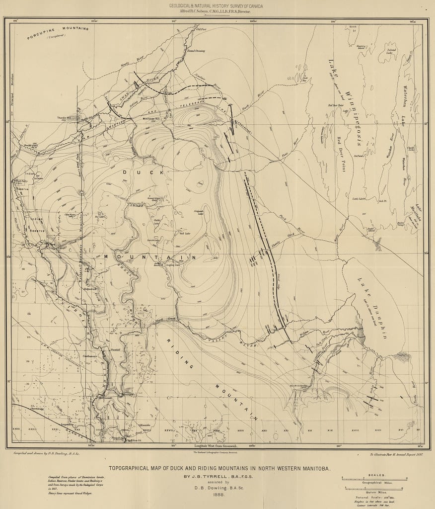
Topographic Map of Duck and Riding Mountains in North Western Manitoba (1888) — by Manitoba Historical Maps via flickr, BY 2.0.
The scoreboard: 25 models, and a 75% ceiling
The headline result is that the best model tested, Gemini-3.1-Pro, scored 75.03% overall. For a benchmark built from multiple-choice and ordering questions, where random guessing already gets you something, that's a meaningfully low ceiling for a frontier model in 2026.
A few things stand out in the full leaderboard of 25 models. First, the gap between top proprietary and top open-source models is smaller than you'd expect: Qwen3.5-397B-A17B hit 72.22%, within three points of Gemini-3.1-Pro, and clearly ahead of several other proprietary systems including GPT-5 (56.54%), Claude-Sonnet-4-5 (45.04%), and GPT-4o, which came in last among all 25 models at 31.47%. If you've been assuming "proprietary flagship" automatically means "best at visual reasoning," this leaderboard argues otherwise.
Second, performance falls off a cliff as reasoning gets harder. Gemini-3.1-Pro's own scores by difficulty tell the story: 88.24% on Level 1 (perception), 81.53% on Level 2 (single-step reasoning), and 62.88% on Level 3 (multi-step reasoning). Reading a symbol off a map is one thing. Chaining several spatial facts together to answer a question is a different skill, and it's the one that's clearly still developing.
Third, category matters a lot. Models do comparatively well on categories like Tourism, where maps tend to include more conventional labeled text (landmark names, street signs) that models can lean on. They do worse on Topography & Remote Sensing, where the information is encoded in dense, non-standard symbols, contour lines, and continuous color gradients rather than discrete labeled text. That's consistent with the paper's whole thesis: the harder a map is to talk about in words, the harder it is for current models.
There's also a control experiment worth mentioning. The authors ran a "no-image" baseline: give the model only the question and answer choices, no image and no description at all, to see whether the benchmark could be gamed purely through answer-choice bias or general world knowledge. Average accuracy across three tested models dropped from 58.87% with normal access to 23.35% blind. That's close to what you'd expect from something between random guessing and mild bias toward plausible-sounding answers, which is good news: it means the benchmark isn't secretly solvable by a model that's just good at picking the least-weird-sounding multiple-choice answer.
Why it matters for anyone building or choosing an OCR pipeline
If your product touches documents that are fundamentally spatial rather than textual, floor plans, transit maps, site diagrams, evacuation routes, GIS overlays, this paper is a warning label. A pipeline that works by running OCR or a "describe this image" pass and then handing the resulting text to an LLM will quietly fail on exactly this class of document, because the information that matters (what's near what, which path connects to which room, which region is shaded which color) doesn't survive being flattened into a caption. The DocVQA-style benchmark numbers that OCR and document-AI vendors like to publish don't tell you anything about how their system handles this category, because those benchmarks are, by this paper's own measurement, largely solvable through text shortcuts.
The practical move is to test with the actual failure mode in mind rather than trust an aggregate accuracy score. Ask whether an engine can trace a route through a floor plan and report what's along it, not whether it can transcribe text inside a bounding box. If you're evaluating OCR or document-AI vendors for anything involving maps, blueprints, technical schematics, or diagrams, don't take "we handle visual documents" at face value: ask for accuracy specifically on multi-step, spatially grounded questions, because that's the exact place general-purpose OCR pipelines and even strong LVLMs currently strain. Right now, even the best model in the world tops out at three-quarters accuracy on this. If your use case depends on getting that last quarter right, plan for human review or a narrower, purpose-built approach rather than assuming a generic vision-language model will get you there out of the box.
Where this benchmark is thinner than it looks
A few caveats are worth keeping in mind before treating OmniMapBench as gospel. At 2,096 QA pairs, it's small next to the 50,000-plus cases in DocVQA or the tens of thousands in some chart benchmarks, and the category distribution is lopsided: Indoor Navigation, Education & History, and Engineering & Facilities together make up more than half the images, while Game maps account for less than 40 images total. A benchmark that thin in its smallest categories can be noisy at the category level even if the aggregate numbers are solid.
The VDI metric itself also leans on a single reference model (GPT-4.1) to generate the descriptions used for the text-only comparison. The authors ran an ablation swapping in a different reference model and found consistent trends, which helps, but the metric is still fundamentally asking "how good is this one model at describing this benchmark in words," not some model-independent property of the images themselves. And the benchmark covers English and Chinese only (61% and 39% of questions respectively), so it says nothing about how these results might shift for maps annotated in other languages or scripts.
None of that undercuts the core finding. Even with a smaller dataset and an imperfect metric, the gap between OmniMapBench's VDI and everything else tested is large enough to be convincing, and a 75% ceiling from the best model in the world is a real result, not a rounding error. The paper's actual contribution is less "here is the definitive map benchmark" and more "here is a method for telling whether your benchmark is testing vision or testing reading comprehension in disguise." That's a tool worth having, and it's one that's overdue given how many "visual reasoning" leaderboards are currently, probably unknowingly, measuring something closer to the latter.